
Copula is a method of modeling dependencies between several variables,which is widely used in finance. In this article I will try to describe its basic principles and demonstrate how it works on simple examples. I assume that the reader is familiar with basic probability theory and understands the concepts of probability density functions (PDFs) and cumulative density functions (CDFs).
Before we begin there is another concept from probability theory that I want to introduce, namely, Probability Integral Transform (also known as universality of uniform). Basically it says that we can transform any random variable to uniform random variable. To do this we just need to plug in the data we have into the corresponding CDF. Let’s look at a simple example.
| X = stats.norm.rvs(size=10000) | |
| X_transformed = stats.norm.cdf(X) | |
| plt.figure(figsize=(18,6)) | |
| plt.subplot(121) | |
| plt.hist(X, density=True, bins=10) | |
| plt.title('Histogram of X') | |
| plt.subplot(122) | |
| plt.hist(X_transformed, density=True, bins=10) | |
| plt.title('Histogram of transformed X') |

On the histograms above you can see how data generated from standard Gaussian distribution is transformed to Uniform(0,1) distribution. It also works in the opposite direction: we can transform uniform random variable to any other distribution by plugging uniform data into corresponding inverse CDF (also known as percentile function). It is demonstrated in the example below.
| X = stats.uniform.rvs(size=10000) | |
| X_transformed = stats.norm.ppf(X) | |
| plt.figure(figsize=(18,6)) | |
| plt.subplot(121) | |
| plt.hist(X, density=True, bins=10) | |
| plt.title('Histogram of X') | |
| plt.subplot(122) | |
| plt.hist(X_transformed, density=True, bins=10) | |
| plt.title('Histogram of transformed X') |

Now we are ready to talk about copulas.
So what is copula? There are several ways to define it, but I think the simplest definition is in probabilistic terms. According to that definition, copula is just a joint CDF of multiple random variables with marginal distributions Uniform(0,1). Copula allows us to separate modeling of dependence structure from modeling marginal distributions (because we can use probability integral transform to transfrom uniform distribution to any distribution of our choice).
Let’s start with a simple example. I will first describe it mathematically and then demonstrate how it works in code. Assume we have two independent random variables X and Y.

Since X and Y are independent, their joint CDF is equal to the product of their marginal CDFs.

The equation above defines a joint CDF of two independent random variables, but it is not a copula yet. To transform the joint CDF into copula we need to make sure that marginals are uniform. To do this we can use probability integral transform: apply to each variable its cumulative distribution function. Then we get:

The function above is a copula (called product copula). Let’s see how it works in practice. First let’s generate some data and look at the plots.
| dist_x = stats.expon() | |
| dist_y = stats.norm() | |
| X = dist_x.rvs(size=10000) | |
| Y = dist_y.rvs(size=10000) | |
| fig, ax = plt.subplots(figsize=(18,4), nrows=1, ncols=3) | |
| ax[0].hist(X, density=True) | |
| ax[0].set(title='Histogram of X', xlabel='Value', ylabel='Frequency') | |
| ax[1].hist(Y, density=True) | |
| ax[1].set(title='Histogram of Y', xlabel='Value', ylabel='Frequency') | |
| ax[2].scatter(X,Y, alpha=0.2) | |
| ax[2].set(title='Scatterplot of X and Y', xlabel='X', ylabel='Y') |
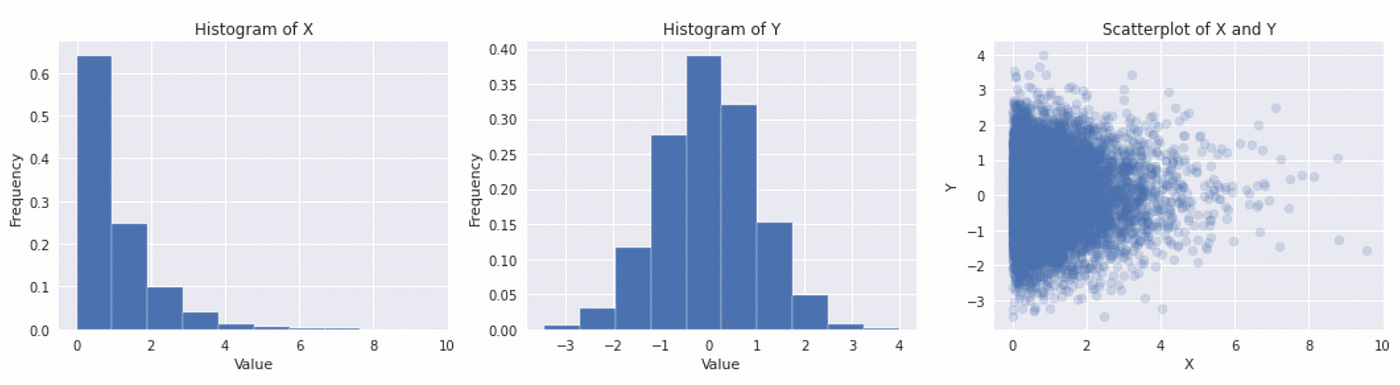
We generated two variable — X (exponential) and Y (Gaussian). Their histograms and scatterplot are presented above. Now we are ready to compute and plot a product copula for these two variables.
| from mpl_toolkits.mplot3d import Axes3D | |
| from matplotlib import cm | |
| fig = plt.figure(figsize=(18,6)) | |
| ax0 = fig.add_subplot(121, projection='3d') | |
| ax1 = fig.add_subplot(122) | |
| x = np.arange(0,1,0.01) | |
| y = np.arange(0,1,0.01) | |
| x,y = np.meshgrid(x,y) | |
| # apply inverse CDF to each point on a grid | |
| pairs = np.array([[i, j] for (i,j) in zip(dist_x.ppf(x).flatten(),dist_y.ppf(y).flatten())]) | |
| # calculate the product of two CDFs for each point on a grid | |
| z = dist_x.cdf(pairs[:,0]).reshape([100,100]) * dist_y.cdf(pairs[:,1]).reshape([100,100]) | |
| ax0.plot_surface(x, y, z, cmap=cm.coolwarm, rstride=10, cstride=10, linewidth=1) | |
| ax0.invert_yaxis() | |
| ax0.set(title='3D surface copula representation') | |
| img = ax1.imshow(np.flip(z,axis=0), cmap=cm.coolwarm, extent=[0,1,0,1]) | |
| ax1.grid(False) | |
| ax1.set(title='Heatmap copula representation') | |
| fig.colorbar(img) |

To calculate product copula we simply multiply the CDFs of two random variables (line 15 in the code above). It is very difficult to understand the dependence structure from the copula plots above. There are other possible representations which are easier to understand.
The plot below shows histograms of individual transformed variables and their joint scatterplot. We can see on the histograms that transormed variables are uniform. On a scatterplot it is a lot easier to see (compared to CDF plot) that two variables are independent — data points are equally distributed on a unit square. But technically it is not a copula (since by definition copula must be a CDF of several variables and therefore in bivariate case it should be a 3D surface). One way to think about this scatterplot is as a bivariate PDF with uniform marginals (which is a derivative of a copula). The density of data points on a given part of the plot represent the value of PDF.

Since the variable are independent, this example is not very interesting, but it is useful for understanding the basic building blocks of copulas.
Now let’s discuss Gaussian copulas. Mathematically bivariate Gaussian copula is defined as follows:

This formula might not make sense at a first glance. Let’s try to build a Gaussian copula in Python step by step.
| # define copula parameters | |
| rho = 0.8 | |
| mu_c = np.array([0,0]) | |
| cov_c = np.array([[1,rho],[rho,1]]) | |
| # define multivariate normal distribution | |
| dist_c = stats.multivariate_normal(mean=mu_c, cov=cov_c) | |
| # sample from the distribution | |
| sample_c = dist_c.rvs(size=10000) | |
| # obtain marginals X and Y | |
| X = sample_c[:,0] | |
| Y = sample_c[:,1] | |
| # plot marginals and joint distribution | |
| fig, ax = plt.subplots(figsize=(18,4), nrows=1, ncols=3) | |
| ax[0].hist(X, density=True) | |
| ax[0].set(title='Histogram of X', xlabel='Value', ylabel='Frequency') | |
| ax[1].hist(Y, density=True) | |
| ax[1].set(title='Histogram of Y', xlabel='Value', ylabel='Frequency') | |
| ax[2].scatter(X, Y, alpha=0.2) | |
| ax[2].set(title='Scatterplot of X and Y', xlabel='X', ylabel='Y') |
Look at the code above. First we define parameters of the multivariate normal distribution which we will use to construct our copula. The only parameter that we need to choose is the correlation coefficient (rho). Thenwe define the mean vector and covariance matrix and use them to define the distribution. After that we obtain a random sample and split it in two variables (X and Y). Below you can see the plots of marginals and joint distribution.

The plots above are exactly what we would expect from bivariate Gaussian. But that is not a copula yet. The code for computing and plotting the copula is presented below.
| # create a grid | |
| x = np.arange(0.01,1.01,0.01) | |
| y = np.arange(0.01,1.01,0.01) | |
| x,y = np.meshgrid(x,y) | |
| # apply inverse standard normal CDF to each point on a grid | |
| pairs = np.array([[i, j] for (i,j) in zip(stats.norm.ppf(x).flatten(),stats.norm.ppf(y).flatten())]) | |
| # calculate the value of bivariate normal CDF for each point on a grid | |
| z = dist_c.cdf(pairs).reshape([100,100]) | |
| # plot the resulting copula | |
| fig = plt.figure(figsize=(18,6)) | |
| ax0 = fig.add_subplot(121, projection='3d') | |
| ax1 = fig.add_subplot(122) | |
| ax0.plot_surface(x, y, z, cmap=cm.coolwarm, rstride=10, cstride=10, linewidth=1) | |
| ax0.invert_yaxis() | |
| ax0.set(title='3D surface copula representation') | |
| img = ax1.imshow(np.flip(z,axis=0), cmap=cm.coolwarm, extent=[0,1,0,1]) | |
| ax1.grid(False) | |
| ax1.set(title='Heatmap copula representation') | |
| fig.colorbar(img) |
The key lines here are lines 7 and 9. On line 7 we apply the inverse standard normal CDF to each point on a grid. On line 9 we plug in the results into the CDF of bivariate normal distribution defined earlier. That’s it, you can see the resulting plot below.

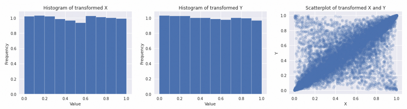
Again you can notice that it is difficult to analyze such plots. Let’s try to use density plots.
| # transform marginals to uniform | |
| u_x = stats.norm.cdf(X) | |
| u_y = stats.norm.cdf(Y) | |
| # plot marginals and joint distribution | |
| fig, ax = plt.subplots(figsize=(18,4), nrows=1, ncols=3) | |
| ax[0].hist(u_x, density=True) | |
| ax[0].set(title='Histogram of transformed X', xlabel='Value', ylabel='Frequency') | |
| ax[1].hist(u_y, density=True) | |
| ax[1].set(title='Histogram of transformed Y', xlabel='Value', ylabel='Frequency') | |
| ax[2].scatter(u_x, u_y, alpha=0.2) | |
| ax[2].set(title='Scatterplot of transformed X and Y', xlabel='X', ylabel='Y') |

Here we use probability integral transform to transform marginal distributions to Uniform(0,1) and then plot individual distributions along with joint distribution scatterplot. Although technically it is not a copula, in this representation it is a lot easier to see the dependency structure between two variables. From now on I will use such scatterplots for demonstrating copulas.
Let’s look at Gaussian copulas with different correlation coefficients (rho).

So what is the point of all this? Why don’t we just use multivariate Gaussian? In multivariate Gaussian marginal distributions must also be Gaussian. When we use copula, we can use probability integral transform to convert uniform marginals to any distribution we want (while preserving dependency structure). In the example below I use Gaussian copula to derive joint distribution with Exponential and Gamma marginals.
| # define copula parameters | |
| rho=0.8 | |
| mu_c = np.array([0,0]) | |
| cov_c = np.array([[1,rho],[rho,1]]) | |
| dist_c = stats.multivariate_normal(mean=mu_c, cov=cov_c) | |
| sample_c = dist_c.rvs(size=10000) | |
| # transform marginals to uniform | |
| X = sample_c[:,0] | |
| Y = sample_c[:,1] | |
| u_x = stats.norm.cdf(X) | |
| u_y = stats.norm.cdf(Y) | |
| # define required marginal distributions | |
| dist_x = stats.expon() | |
| dist_y = stats.gamma(a=2) | |
| fig, ax = plt.subplots(figsize=(18,6), nrows=1, ncols=2) | |
| ax[0].scatter(u_x, u_y, alpha=0.2) | |
| ax[0].set(title=r'Gaussian copula $\rho$=' + str(rho), xlabel='X', ylabel='Y') | |
| ax[1].scatter(dist_x.ppf(u_x), dist_y.ppf(u_y), alpha=0.2) | |
| ax[1].set(title='Joint distribution derived from copula', xlabel='X', ylabel='Y') |
To convert uniform marginals from copula into any distribution we want, we just plug them in the inverse CDF (percentile function) of the required distribution (see line 20).

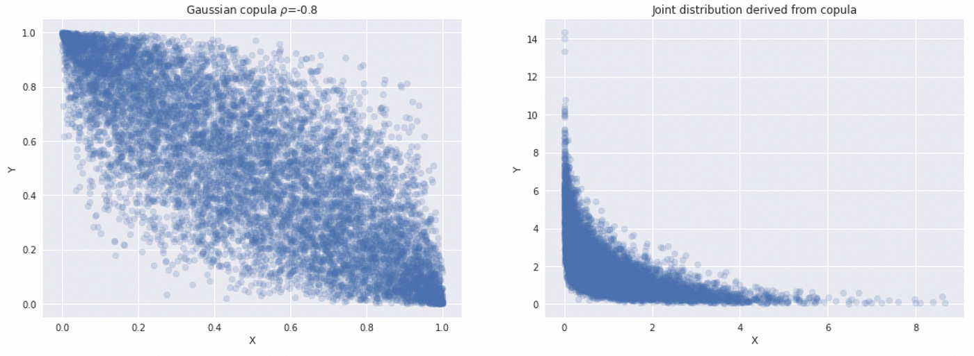
Since every copula by definition has uniform marginals, we can use it to derive a joint distribution for any marginals we want. This is how copula allows us to separate modeling the dependence structure from modeling marginal distributions. For now we have only considered one type of copula, but there are many different families of copulas that allow us to define different dependencies between variables.
Now let’s consider another simple copula — Student’s t copula. It’s definition is similar Gaussian copula, we just use Student’s t distributions everywhere instead of Gaussian:

Let’s follow the same process again and construct a copula. For Student’s t copula we need two parameters: correlation coefficient rho and number of degrees of freedom nu. First we define a multivariate t distribution using those parameters, obtain a random sample from it and split it into two variables. Below you can see the plots of resulting marginal and joint distributions.

Note that we get fatter tails compared to Gaussian distribution, which is expected from Student’s t distribution with one degree of freedom. To get a copula we need to transform our marginals by plugging them into the inverse CDF of univariate t distribution with one degree of freedom.
We get uniform marginals and a joint distribution representing our copula. The code for constructing this copula is provided below.
| # set copula parameters | |
| rho = 0.8 | |
| nu = 1 | |
| # define t distribution | |
| mu_c = np.array([0,0]) | |
| cov_c = np.array([[1,rho],[rho,1]]) | |
| dist_c = stats.multivariate_t(loc=mu_c, shape=cov_c, df=nu) | |
| # obtain random sample | |
| sample_c = dist_c.rvs(size=10000) | |
| # obtain marginals X and Y | |
| X = sample_c[:,0] | |
| Y = sample_c[:,1] | |
| # plot marginals and joint distribution | |
| fig, ax = plt.subplots(figsize=(18,4), nrows=1, ncols=3) | |
| ax[0].hist(X, density=True, range=(-15,15), bins=30) | |
| ax[0].set(title='Histogram of X', xlabel='Value', ylabel='Frequency') | |
| ax[1].hist(Y, density=True, range=(-15,15), bins=30) | |
| ax[1].set(title='Histogram of Y', xlabel='Value', ylabel='Frequency') | |
| ax[2].scatter(X, Y, alpha=0.2) | |
| ax[2].set(title='Scatterplot of X and Y', xlabel='X', ylabel='Y', xlim=(-15,15), ylim=(-15,15)) | |
| # transform variables to uniform | |
| u_x = stats.t.cdf(X, df=nu) | |
| u_y = stats.t.cdf(Y, df=nu) | |
| # plot marginals and joint distribution | |
| fig, ax = plt.subplots(figsize=(18,4), nrows=1, ncols=3) | |
| ax[0].hist(u_x, density=True) | |
| ax[0].set(title='Histogram of transformed X', xlabel='Value', ylabel='Frequency') | |
| ax[1].hist(u_y, density=True) | |
| ax[1].set(title='Histogram of transformed Y', xlabel='Value', ylabel='Frequency') | |
| ax[2].scatter(u_x, u_y, alpha=0.2) | |
| ax[2].set(title='Scatterplot of transformed X and Y', xlabel='X', ylabel='Y') |
Let’s try to construct a joint distribution of Exponential and Gamma random variables using Student’s t copula and compare it with the one we got from Gaussian copula.


Even though we used the same marginal distributions in both cases, the joint distributions we got are different. On the picture below I plotted joint distributions along with marginal distributions.

It is easy to see that marginal distributions look identical, but joint distributions are different. So when we want to use copula in practice we will need to determine what copula (with what parameters) best fits our data. Let’s look on the plots of Student’s t copula with different parameters. Recall that we need two parameters to define Student’s t copula — correlation coefficient rho, and number of degrees of freedom nu. Below you can see a plot of Student’s t copulas with different combinations of parameters.

We can see that as the number of degrees of freedom increases, Student’s t copula gets more similar to Gaussian copula. The code for generating these plots is provided below.
| fig, ax = plt.subplots(figsize=(18,12), nrows=2, ncols=3) | |
| rhos = [-0.8, 0.5] | |
| nus = [1, 4, 10] | |
| for i,rho in enumerate(rhos): | |
| for j,nu in enumerate(nus): | |
| # define t distribution | |
| mu_c = np.array([0,0]) | |
| cov_c = np.array([[1,rho],[rho,1]]) | |
| dist_c = stats.multivariate_t(loc=mu_c, shape=cov_c, df=nu) | |
| # obtain random sample | |
| sample_c = dist_c.rvs(size=10000) | |
| # obtain marginals X and Y | |
| X = sample_c[:,0] | |
| Y = sample_c[:,1] | |
| # transform variables to uniform | |
| u_x = stats.t.cdf(X, df=nu) | |
| u_y = stats.t.cdf(Y, df=nu) | |
| # plot copula | |
| ax[i,j].scatter(u_x, u_y, alpha=0.2) | |
| ax[i,j].set(title=r"Student's t copula, $\nu=$" + str(nu) + r", $\rho=$" + str(rho)) |
Now let’s look at a couple of examples. In both examples I will use Gaussian marginals and Gaussian copula, but the results will be very different. Look at the code below.
| # generate data | |
| n = 10000 | |
| X = np.random.randn(n) | |
| Y = 1.6*X + np.random.randn(n) | |
| # plot marginals and joint distribution | |
| fig, ax = plt.subplots(figsize=(18,4), nrows=1, ncols=3) | |
| ax[0].hist(X, density=True) | |
| ax[0].set(title='Histogram of X', xlabel='Value', ylabel='Frequency') | |
| ax[1].hist(Y, density=True) | |
| ax[1].set(title='Histogram of Y', xlabel='Value', ylabel='Frequency') | |
| ax[2].scatter(X, Y, alpha=0.2) | |
| ax[2].set(title='Scatterplot of X and Y', xlabel='X', ylabel='Y') | |
| # determine parameters of marginals and correlation coefficient | |
| mu_x, std_x = np.mean(X), np.std(X) | |
| mu_y, std_y = np.mean(Y), np.std(Y) | |
| dist_x = stats.norm(loc=mu_x, scale=std_x) | |
| dist_y = stats.norm(loc=mu_y, scale=std_y) | |
| rho = np.corrcoef(X,Y)[0,1] | |
| # construct Gaussian copula | |
| mu_c = np.array([0,0]) | |
| cov_c = np.array([[1,rho],[rho,1]]) | |
| C = stats.multivariate_normal(mean=mu_c, cov=cov_c) | |
| C_sample = C.rvs(size=n) | |
| # plot real data and simulated data from copula | |
| fig, ax = plt.subplots(figsize=(18,4), nrows=1, ncols=3) | |
| ax[0].scatter(X, Y, alpha=0.2, label='real') | |
| ax[0].set(xlabel='X', ylabel='Y') | |
| ax[0].legend() | |
| ax[1].scatter(dist_x.ppf(stats.norm.cdf(C_sample[:,0])), | |
| dist_y.ppf(stats.norm.cdf(C_sample[:,1])), | |
| alpha=0.2, label='synthetic', c='tab:orange') | |
| ax[1].set(xlabel='X', ylabel='Y') | |
| ax[1].legend() | |
| ax[2].scatter(X,Y, alpha=0.2, label='real') | |
| ax[2].scatter(dist_x.ppf(stats.norm.cdf(C_sample[:,0])), | |
| dist_y.ppf(stats.norm.cdf(C_sample[:,1])), | |
| alpha=0.2, label='synthetic', c='tab:orange') | |
| ax[2].set(xlabel='X', ylabel='Y') | |
| ax[2].legend() |
First we generate two correlated Gaussian random variables. On the plot below you can see that both marginal distributions look like Gaussian and their joint distribution looks like multivariate Gaussian with positive correlation coefficient.

Next we calculate mean and standard deviation of marginals, which are used as parameters to define marginal distributions. Correlation coefficient between X and Y is calculated to use as parameter for constructing Gaussian copula. The rest of the code is similar to that we used before: we define a copula and use it to generate some data. Then we plot real (original) and synthetic data together to check how well they fit.

In this example we see that simulated data very closely fit real data. That means that copula correctly models the joint distribution between two variables. Now let’s look at another example (adapted from here).
| # generate data | |
| n = 10000 | |
| X = np.random.randn(n) | |
| Z = np.random.randn(n) | |
| Y = np.ones(n) | |
| condition = (((X<0) & (Z>=0)) | ((X>0) & (Z<=0))) | |
| Y[condition] = -Z[condition] | |
| Y[~condition] = Z[~condition] | |
| # plot marginals and joint distribution | |
| fig, ax = plt.subplots(figsize=(18,4), nrows=1, ncols=3) | |
| ax[0].hist(X, density=True) | |
| ax[0].set(title='Histogram of X', xlabel='Value', ylabel='Frequency') | |
| ax[1].hist(Y, density=True) | |
| ax[1].set(title='Histogram of Y', xlabel='Value', ylabel='Frequency') | |
| ax[2].scatter(X, Y, alpha=0.2) | |
| ax[2].set(title='Scatterplot of X and Y', xlabel='X', ylabel='Y') | |
| # determine parameters of marginals and correlation coefficient | |
| mu_x, std_x = np.mean(X), np.std(X) | |
| mu_y, std_y = np.mean(Y), np.std(Y) | |
| dist_x = stats.norm(loc=mu_x, scale=std_x) | |
| dist_y = stats.norm(loc=mu_y, scale=std_y) | |
| rho = np.corrcoef(X,Y)[0,1] | |
| # construct Gaussian copula | |
| mu_c = np.array([0,0]) | |
| cov_c = np.array([[1,rho],[rho,1]]) | |
| C = stats.multivariate_normal(mean=mu_c, cov=cov_c) | |
| C_sample = C.rvs(size=n) | |
| # plot real data and simulated data from copula | |
| fig, ax = plt.subplots(figsize=(18,4), nrows=1, ncols=3) | |
| ax[0].scatter(X, Y, alpha=0.2, label='real') | |
| ax[0].set(xlabel='X', ylabel='Y') | |
| ax[0].legend() | |
| ax[1].scatter(dist_x.ppf(stats.norm.cdf(C_sample[:,0])), | |
| dist_y.ppf(stats.norm.cdf(C_sample[:,1])), | |
| alpha=0.2, label='synthetic', c='tab:orange') | |
| ax[1].set(xlabel='X', ylabel='Y') | |
| ax[1].legend() | |
| ax[2].scatter(X,Y, alpha=0.2, label='real') | |
| ax[2].scatter(dist_x.ppf(stats.norm.cdf(C_sample[:,0])), | |
| dist_y.ppf(stats.norm.cdf(C_sample[:,1])), | |
| alpha=0.2, label='synthetic', c='tab:orange') | |
| ax[2].legend() |
Here we first generate two independent standard normal random variables and then change the sign of a second variable based on a certain condition. The resulting distributions are depicted below.
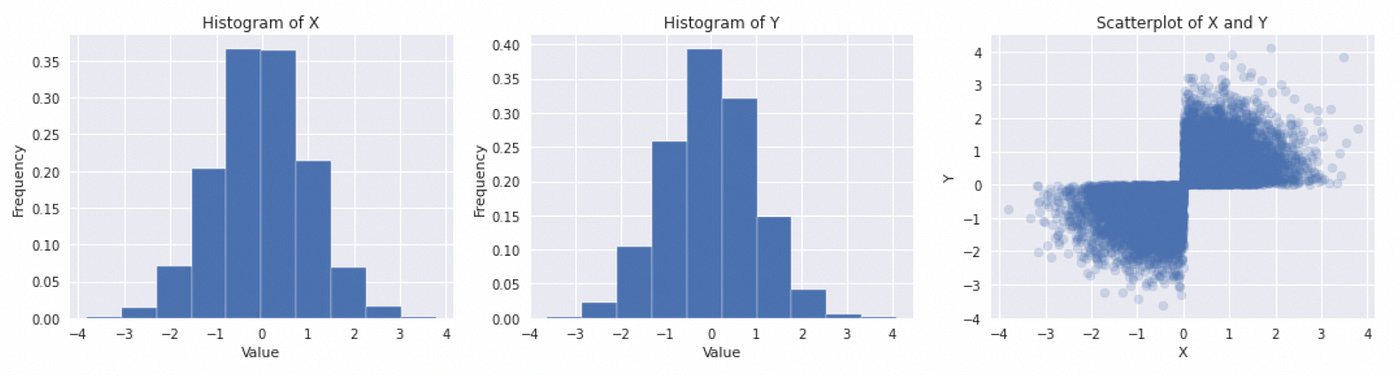
The marginal distributions look like Gaussian, but their joint distribution is clearly not. The rest of the code is the same. On the plot below you can see what happens if we try to use Gaussian copula to model joint distribution.
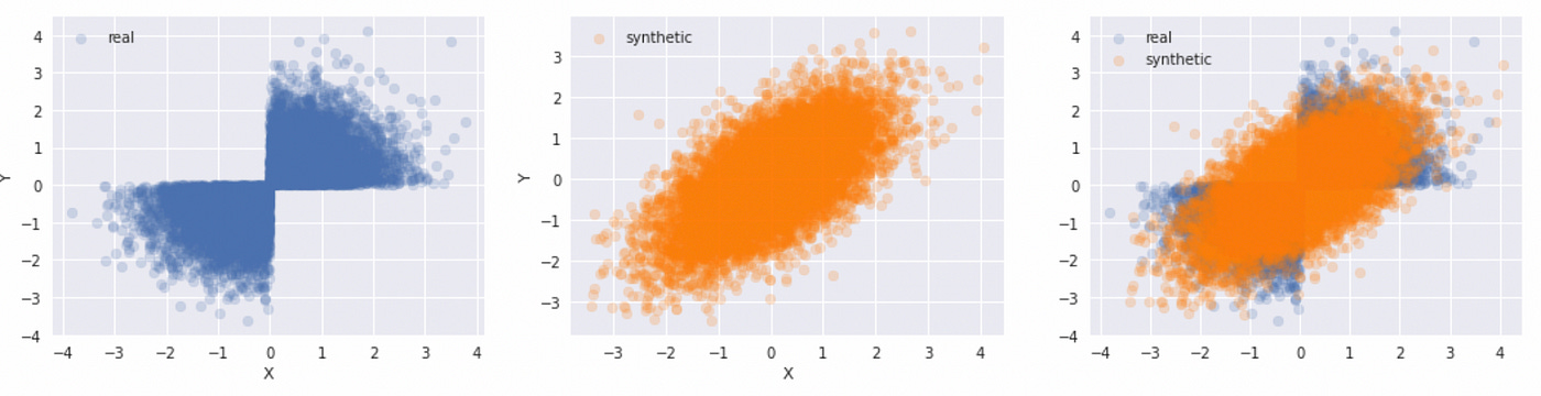
We can clearly see that Gaussian copula is not a good choice for modeling such dependence structure. This is important to remember. It is a common mistake to assume that if marginal distributions are Gaussian, then their joint distribution must be multivariate Gaussian, but in general that is not the case.
In this post I only covered some basics and considered only three basic copula families. In the following posts I will review other copulas, describe how to fit copulas to data and try to implement copula-based pairs trading strategy.
Jupyter notebook with source code is available here.
If you have any questions, suggestions or corrections please post them in the comments. Thanks for reading.