In this article I will investigate the idea of using autoregressive-moving-average (ARMA) models to predict stock prices. It is based on a paper ‘Stock Price Prediction Using the ARIMA Model’ (Ariyo et al. 2014). In my previous articles I mostly used more advanced methods of modeling and I realized that I never really tried working with some basic time series models (like ARMA). Here I’ll try to fix this gap.
I am assuming that the reader is familiar with basic theory of ARMA models. If you need to refresh your knowledge, there are some useful references in the end of this article.
First let’s see how to work with ARMA model on synthetic data. I am going to use some examples from statsmodels tutorials ([2], [3]). Basically I’ll just replicate a synthetic example from one of the tutorials adding some comments and explanations.
First we need some data to work with. Let’s generate a sample from ARMA(2,2) model.
| np.random.seed(12345) | |
| # set parameters | |
| arparams = np.array([0.75, -0.25]) | |
| maparams = np.array([0.65, 0.35]) | |
| arparams = np.r_[1, -arparams] | |
| maparams = np.r_[1, maparams] | |
| nobs = 250 | |
| y = arma_generate_sample(arparams, maparams, nobs) |
Note that we need to add 1 for the zero-lag of AR and MA parameters and that AR parameters must be negated.
We can add some dates as an index (for conveniece) and plot the resulting time series.
| dates = pd.date_range("1980-1-1", freq="M", periods=nobs) | |
| y = pd.Series(y, index=dates) |
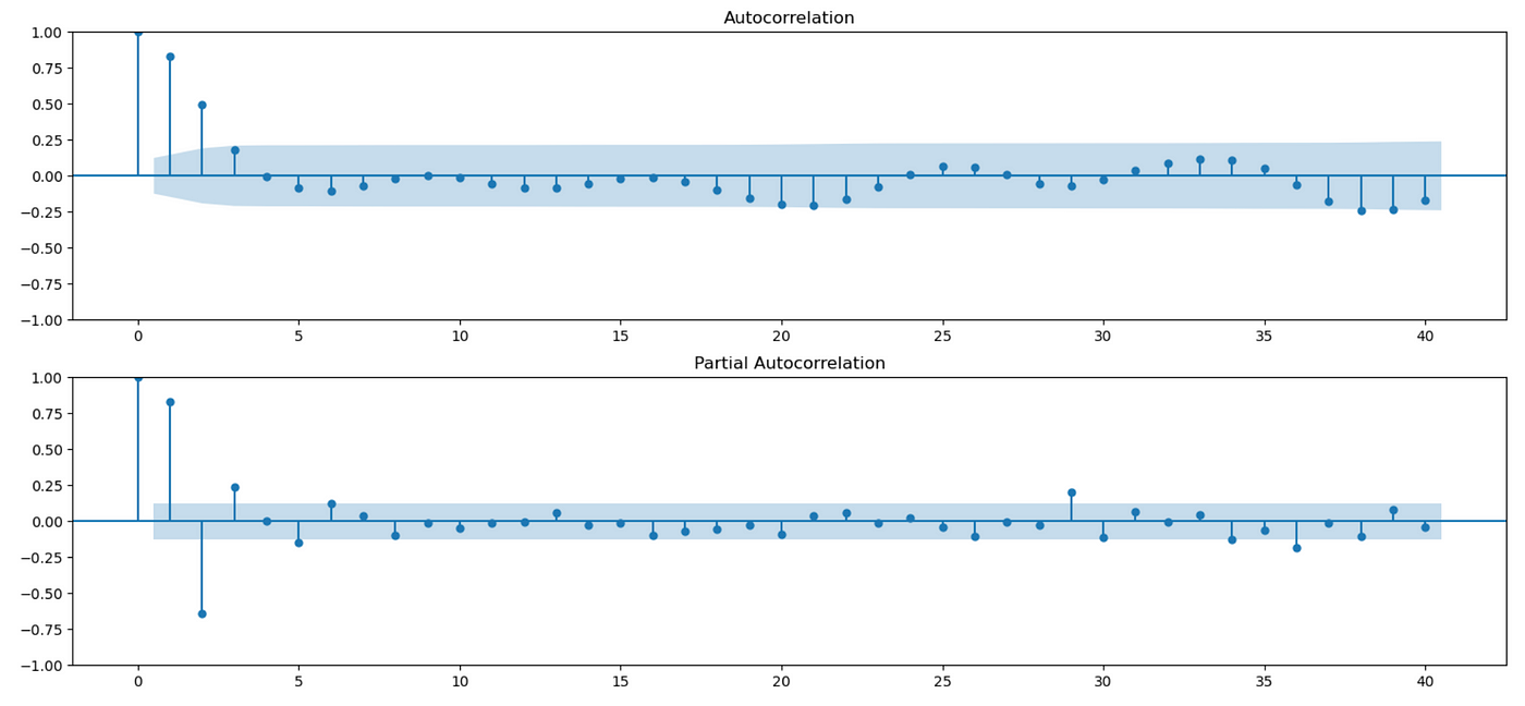
Let’s try to analyze the generated sample. First we typically use ACF and PACF plots to see if there are any autocorrelations in the data and determine the order of the model. There are functions in statsmodels library to generate these plots. Code for doing it is shown below.
| fig = plt.figure(figsize=(18, 8)) | |
| ax1 = fig.add_subplot(211) | |
| fig = sm.graphics.tsa.plot_acf(y.values.squeeze(), lags=40, ax=ax1) | |
| ax2 = fig.add_subplot(212) | |
| fig = sm.graphics.tsa.plot_pacf(y.values.squeeze(), lags=40, ax=ax2) |
Usually the presence of autocorrelations on PACF plot (bottom) indicates the presence of AR terms. The presence of autocorrelations on ACF plot (top) indicates the presence of MA terms. But these plots might not be very informative for mixed ARMA models, so for now let’s assume that the model order is known (and I’ll return to this question later). We fit the model and get the following results.
As you can see above, our estimates are close to the true values of model parameters.
We can analyze the goodness of fit of the model by studying its residuals. We expect them to be a white noise process — having zero mean, finite variance and no serial correlations.
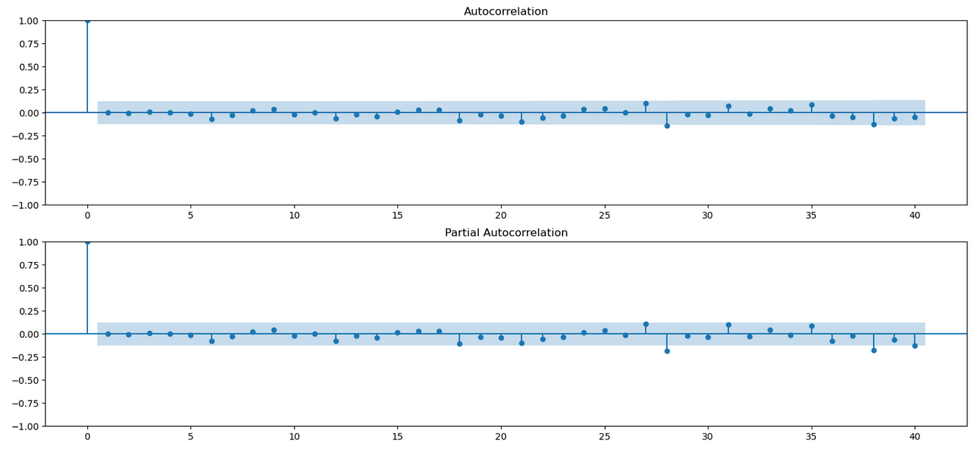
Look at the residuals plot above. It seems that it has zero mean and constant variance. To check for autocorrelations we can look at ACF and PACF plots.
| fig = plt.figure(figsize=(18, 8)) | |
| ax1 = fig.add_subplot(211) | |
| fig = sm.graphics.tsa.plot_acf(arma_res.resid.values, lags=40, ax=ax1) | |
| ax2 = fig.add_subplot(212) | |
| fig = sm.graphics.tsa.plot_pacf(arma_res.resid.values, lags=40, ax=ax2) |
As you can see above, autocorrelations for most lags are not statistically significant. There are a few lags, where autocorrelation slightly exceeds the confidence interval, but it is expected. With 95% confidence interval, 5% of results (2 out of 40) might be statistical flukes.
We can also you Durbin-Watson test to check for autocorrelations at lag 1.
Here’s a quote from Wikipedia about interpreting Durbin-Watson statistic:
The value of d always lies between 0 and 4. If the Durbin–Watson statistic is substantially less than 2, there is evidence of positive serial correlation. As a rough rule of thumb, if Durbin–Watson is less than 1.0, there may be cause for alarm. Small values of d indicate successive error terms are positively correlated. If d > 2, successive error terms are negatively correlated. In regressions, this can imply an underestimation of the level of statistical significance.
In our case the value of test statistic is very close to 2, which means that there is no evidence of autocorrelation at lag 1. But we also want to test other lags. We can do so using Ljung-Box Q test as follows.
| r,q,p = sm.tsa.acf(arma_res.resid.values, fft=True, qstat=True) | |
| data = pd.DataFrame(index=np.arange(1,len(p)+1), columns=['AC', 'Q', 'pval']) | |
| data.index.name = 'lag' | |
| data['AC'] = r[1:] | |
| data['Q'] = q | |
| data['pval'] = p |
As a result we get the following dataframe:
First column shows the estimated autocorrelation coefficient at a given lag. Second column contains Q-statistic and third column contains p-value. Null hypothesis of this test is that there are no autocorrelations up to a given lag. As you can see below, there are no lags where we reject the null hypothesis at 1% level, which indicates the presence of serial correlations.
We can also test whether the residuals are normally distributed, although that is not strictly necessary for ARMA models. As I mentioned before, we just need residuals to be white.
You can see above that in our synthetic example residuals are normally distributed — we can’t reject the null hypothesis of normality and QQ-plot looks exactly as it should in case of normal distribution.
Now let’s test the performance of our model in-sample and calculate mean forecast error (MFE) and mean squared error (MSE). Results are shown on a screenshot below, but the numbers we get are not very informative unless we compare them with other models.
There are some plots we can use to assess performance of the model visually. First plot below shows true values of time series along with the values predicted by our model. Note that each prediction is one step ahead, using all the data available up to a current point.
| plt.figure(figsize=(18,4)) | |
| plt.plot(y['1997-01-31':], label='true values') | |
| plt.plot(preds, label='predictions') | |
| plt.legend() |
We can also plot predictions along with 95% confidence interval.
| fig, ax = plt.subplots(figsize=(18, 6)) | |
| fig = plot_predict(arma_res, start='1997-01-31', end='2000-10-31', ax=ax) | |
| legend = ax.legend(loc="upper left") |
As you can see, we can make reasonably good predictions using our model. The procedure I demonstrated above can be used as a template for working with ARIMA models.
Recall that we made an assumption that we know the order of the model. This assumption is not realistic and was made just for simplicity. Usually we don’t know it and we have to determine it from the data. Some sources suggest doing it using ACF and PACF plots, but it seems to work only if we have a simple AR or MA model, not a mixed ARMA model. Here’s a quote from Ruey S. Tsay’s book ‘Analysis of Financial Time Series’ (section 2.6.3) [6]:
The ACF and PACF are not informative in determining the order of an ARMA model. Tsay and Tiao (1984) propose a new approach that uses the extended auto-correlation function (EACF) to specify the order of an ARMA process.
I couldn’t find EACF implementation in Python, so I had to use another method of model identification. In the same book author suggests using information criteria:
The information criteria discussed earlier can also be used to select ARMA(p, q) models. Typically, for some prespecified positive integers P and Q, one computes AIC (or BIC) for ARMA(p,q) models, where 0≤p≤P and 0≤q≤Q, and selects the model that gives the minimum AIC (or BIC). This approach requires maximum-likelihood estimation of many models and in some cases may encounter the difficulty of overfitting in estimation.
In the paper authors use Bayesian Information Criterion (BIC), so I will do the same.
I will test different combinations of AR order p and MA order q and select the one with the lowest BIC.
| import itertools | |
| maxp = 5 | |
| maxq = 5 | |
| res_df = pd.DataFrame(columns=['ARIMA', 'BIC']) | |
| for p,q in itertools.product(np.arange(0,maxp), np.arange(0,maxq)): | |
| # skip (0,0) | |
| if p==0 and q==0: | |
| continue | |
| mod = ARIMA(y, order=(p, 0, q), trend='n') | |
| res = mod.fit() | |
| if res.mle_retvals['converged']: # check that MLE converged | |
| res_df.loc[len(res_df.index)] = [f'({p},0,{q})', res.bic] |
I am testing 25 different combinations (p and q ranging from 0 to 5). In the end I get the following dataframe.
Recall that the true order of the model is (2,0,2). It has second smallest BIC out of all tested models. So here we have failed to estimate the true order of the model, but it is expected because the number of observations we have is not very big — only 250. Also note that selected model is not very different from the true model, so its predictions would probably be quite similar to the ones we got.
Now let’s try to apply ARMA model to stock prices. I will demonstrate how it works on two different stocks — PRK and IVZ. I am using data from 2013–01–01 to 2022–12–31 for training (in-sample), and data from 2023–01–01 to 2023–05–11 for testing (out-of-sample). Data was downloaded from Yahoo Finance.
We start with PRK stock. Code for loading and preparing data is provided below.
| price = pd.read_csv('PRK.csv', index_col=0) | |
| price = price['PRK'] | |
| price_train = price.loc[:'2022-12-31'] | |
| price_test = price.loc['2023-01-01':] | |
| returns = price.pct_change() | |
| returns_test = returns.loc['2023-01-01':] |
First we look at some plots.
| price_train.plot(figsize=(18,4)) | |
| fig = plt.figure(figsize=(18,8)) | |
| ax1 = fig.add_subplot(211) | |
| fig = sm.graphics.tsa.plot_acf(price_train.values, lags=40, ax=ax1) | |
| ax2 = fig.add_subplot(212) | |
| fig = sm.graphics.tsa.plot_pacf(price_train.values, lags=40, ax=ax2) |
We can see on the plot above that our data doesn’t look stationary. The ACF is decaying very slowly, which means that future values are strongly affected by past values. To solve this problem we need to use differencing. In the paper differencing is applied directly to prices, but I believe that differencing log prices is better in this case. Let me show you why.
At the beginning of the training period our stock costs about $40 and by the end of the training period it rises to about $140. Look at the plot of differenced price series below.
In the beginning the stock price is low, so the increments are relatively small. But as the stock price grows, so do the increments. Basically, volatility of differenced prices depends on current price level. We can also check it by calculating the standard deviation of differenced time series during first and last years of data. You can see below that standard deviation during last year is almost 5 times higher, than standard deviation during first year.
Now we can repeat the same, but taking a logarithm before differencing. Recall that when we difference log prices, we get log returns.
We can see here that using log prices significantly improves the situation. There is still a slight increase in volatility in the last part of the data, but it’s probably due to a more volatile market post-pandemic. So from now on I’m going to work with differenced log prices.
| dprice = np.log(price).diff().iloc[1:] | |
| dprice_train = dprice.loc[price_train.index[1:]] | |
| dprice_test = dprice.loc[price_test.index] |
We can use Augmented Dickey-Fuller test to check for the presence of unit root:
Pvalue of the test is 0, which means that there is a 0% chance of unit root in the tested time series.
Let’s look at ACF and PACF plots of differenced data.
| fig = plt.figure(figsize=(18,8)) | |
| ax1 = fig.add_subplot(211) | |
| fig = sm.graphics.tsa.plot_acf(dprice_train.values, lags=40, ax=ax1) | |
| ax2 = fig.add_subplot(212) | |
| fig = sm.graphics.tsa.plot_pacf(dprice_train.values, lags=40, ax=ax2) |
We see some significant autocorrelations on both plots, but as I said before — according to Tsay ([6]), these plots are non-informative for mixed ARMA models.
Now let’s use Ljung-Box Q test.
| r,q,p = sm.tsa.acf(dprice_train.values, fft=True, qstat=True) | |
| data = pd.DataFrame(index=np.arange(1,len(p)+1), columns=['AC', 'Q', 'pval']) | |
| data.index.name = 'lag' | |
| data['AC'] = r[1:] | |
| data['Q'] = q | |
| data['pval'] = p |
Q-test indicates that there some significant autocorrelations starting from the first lag, which means that ARMA model could potentially be useful. First we need to estimate the order. I am going to use the same procedure as before — fitting different models and selecting the one which has the smallest BIC.
| maxp = 5 | |
| maxq = 5 | |
| res_df = pd.DataFrame(columns=['ARIMA', 'BIC']) | |
| for p,q in tqdm(itertools.product(np.arange(maxp), np.arange(maxq))): | |
| with warnings.catch_warnings(): | |
| warnings.simplefilter('ignore') | |
| mod = ARIMA(dprice_train.values, order=(p, 0, q), trend='n') | |
| res = mod.fit() | |
| if res.mle_retvals['converged']: | |
| res_df.loc[len(res_df.index)] = [f'({p},0,{q})', res.bic] |
Results are shown in a dataframe below.
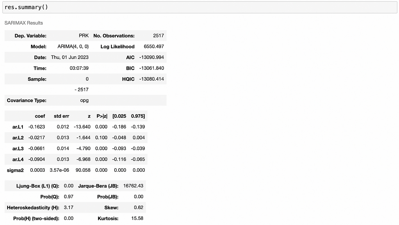
ARIMA(4,0,0) has the lowest BIC, so we will work with it. Let’s fit it and look at its summary.
One thing to note in the summary above is that the confidence interval for ar.L2 contains zero in it, so there is a possibility that ar.L2 coefficient is equal to zero. We could try removing the second lag from the model and checking if it improves model performance, but for simplicity I’ll omit this step.
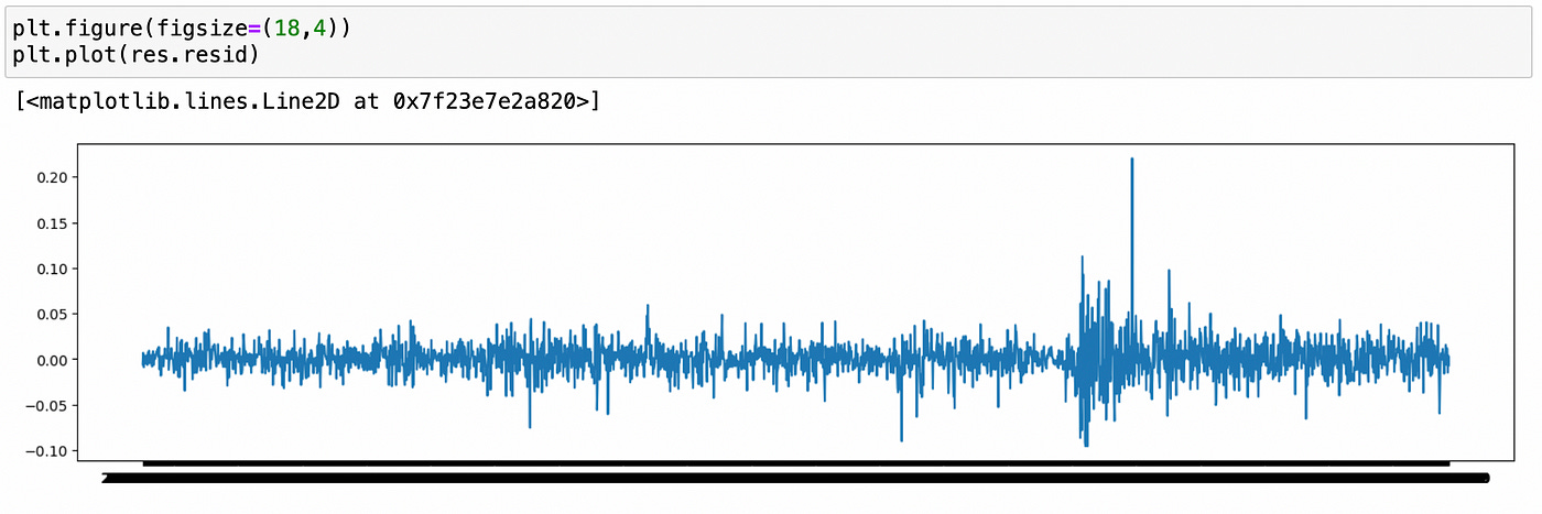
Let’s analyze model residuals.
Residuals look stationary, with constant mean and variance. This is confirmed by ADF test below.
We can try applying tests for normality and using QQ-plot, but I doubt that our residuals will be normal.
As expected, residuals are not normal. We can clearly see the presence of fat tails on QQ-plot.
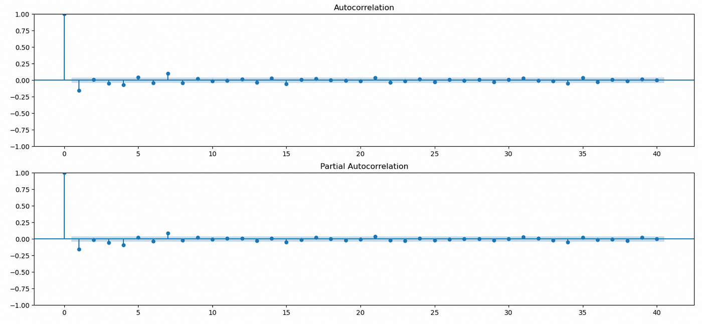
Another important thing to check for is that residuals don’t have any serial correlations. First let’s look at ACF and PACF plots of the residuals.
There seems to be significant autocorrelations at lags 7 and 15, but it might be just a statistical fluke. Recall that at 5% level we can expect 2 out of 40 lags to be false positive.
Ljung-Box Q test gives similar results, but I don’t want to complicate the model by adding additional lags, so we will continue with ARIMA(4,0,0).
In-sample MFE and MSE are shown below.
Now let’s take a look at the plot of our predictions along with the true values. Here I am using just 100 last observations.
Our predictions are quite far from the true values and they don’t seem very useful. But what if we can correctly predict direction of the next move? Then we might be able to use that signal and build a trading strategy based on it.
On a screenshot below you can see that we are able to correctly predict the sign in 54% of all observations. It is not that bad, but we have to keep in mind that it is in-sample.
Let’s see what happens on a test set (out-of-sample).
| main_mod = ARIMA(dprice_train, order=((4, 0, 0), trend='n') | |
| main_res = main_mod.fit() | |
| pred_df = pd.DataFrame(index=dprice_test.index, columns=['p']) | |
| for t in tqdm(pred_df.index): | |
| # prepare data | |
| tmpdf = dprice.loc[:t].iloc[:-1] | |
| # create a model | |
| mod = main_mod.clone(tmpdf.values) | |
| with mod.fix_params(main_res.params): | |
| res = mod.fit() | |
| pred_df.loc[t] = res.predict(len(tmpdf)-1, len(tmpdf))[-1] |
Code for doing multiple one-step ahead forecasts is not very straightforward. At each time step we have to create a copy of an old model and make sure that we are using old coefficients, without retraining it on new data.
In the end we get the following dataframe. The first column (p) is our prediction, and the second column (dprice) is the actual log return (difference of log prices).
Let’s see how accurately we can predict the sign of the next move.
It seems that we got lucky. 63% of all movements are predicted correctly. Can we create a trading strategy using this signal? The simplest strategy would be to go long when our prediction is positive and go short when our prediction is negative. Code for backtesting such strategy is provided below.
| positions = np.sign(pred_df['p']) | |
| ret = positions * returns_test | |
| cumret = (1 + ret).cumprod() |
As you can see above, our strategy performs quite well. What if we try to include transaction costs? For simplicity I’ll just subtract 0.3% from each day return, basically assuming daily rebalancing. In reality transaction costs will probably be a little lower.
Transaction costs significantly decrease profitability, but our strategy still performs quite well. Let’s look at its performance metrics.
Even with transaction costs we get a Sharpe ratio of 1.78, which is not bad.
But before getting too excited let’s try to test another stock. I specifically selected a stock with similar in-sample performance. I’m not going to describe the whole procedure again, you can find it in the corresponding Jupyter notebook. I’ll just demonstrate some key moments.
I am using IVZ stock and the same time frame as before. Plot of its price is shown below.
Recall that we work with log returns — differenced log prices. ACF and PACF plots of log returns are shown below.
It seems that there are some statistically significant autocorrelations present in this time series. Let’s try to estimate model order.
For this stock, ARIMA(1,0,0) model has the lowest BIC. Model summary is provided below.
Predictions again are quite far from the true values and seem useless. What about the signs?
We are able to correctly predict direction of the next move for 53% of observations (in-sample). It is a little worse than for the previous stock (almost 55%), but it is still comparable (and better than random 50% chance). Let’s see how our model performs out-of-sample.
Model accuracy out of sample is only 46%. Trading strategy based on such predictions probably won’t be very profitable, but let’s backtest it anyway.
Even without transaction costs our strategy is losing money. Performance metrics for both stocks (strategies) are shown below.
We have seen two stocks that have similar in-sample accuracy, but perform differently out-of-sample. Of course these two tests are not enough to make a conclusion about usefulness of ARMA model in modeling stock prices. A better way to test it would be to find a portfolio of stocks\models with good in-sample accuracy and try to backtest them all out-of-sample.
We don’t need all stocks\models to be profitable. We don’t even have to be right (about the next price move) more often than wrong. We just need to generate more profits than losses.
Even if we used the same two stocks I tested above and allocated equal amount of capital to each of them, we’d still be able to get a profitable trading strategy (even including transaction costs). PRK with tc generates a profit of 75.88% (annualized) and IVZ with tc generates a loss of 74.99%, which results in a profit of 0.89%.
Thus I believe that ARMA models can potentially be useful in algorithmic trading for modeling prices of some financial assets.
Ideas for further improvements:
Use more than five lags in model selection.
Try using ARMA to model a spread in pairs trading.
Test different data frequencies.
Add some exogenous variables to ARMA model (e.g. daily volume or a price of some market index).
Try to analyze models and predictions in more detail. Maybe in some cases we can predict extreme moves with better accuracy.
Jupyter notebook with source code is available here.
If you have any questions, suggestions or corrections please post them in the comments. Thanks for reading.
References
[1] Stock Price Prediction Using the ARIMA Model
[2] Autoregressive Moving Average (ARMA): Artificial data
[3] Autoregressive Moving Average (ARMA): Sunspots data
[4] https://people.duke.edu/~rnau/arimrule.htm
[5] https://otexts.com/fpp3/arima.html


